You can compare performance between two versions of a model; for example, between an original FP32 model and an optimized INT8 model. Once the optimization procedure is complete, click Compare above the Projects table: 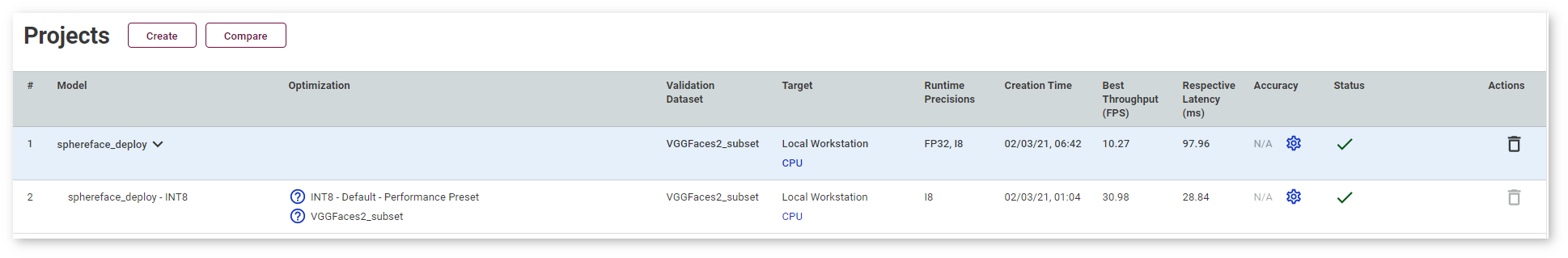
The Setup to Compare Performance page appears: 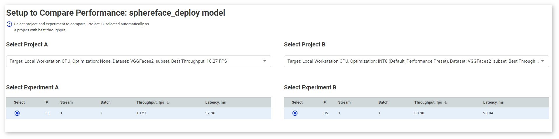
Select project A and project B in the drop-down lists. By default, project B is a project with the best throughput.
NOTE: To leave the Compare Inferences page, click Back to Projects on the right of the page title.
You can select a certain inference experiment within a project by checking the corresponding row: 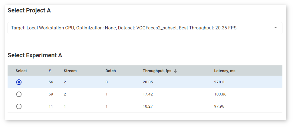
TIP: Uncheck a row to deselect the corresponding experiment.
As you select a version, the graphs with latency and throughput values for both versions appear. The graphs instantly adjust to your selection of versions by adding and removing corresponding points. 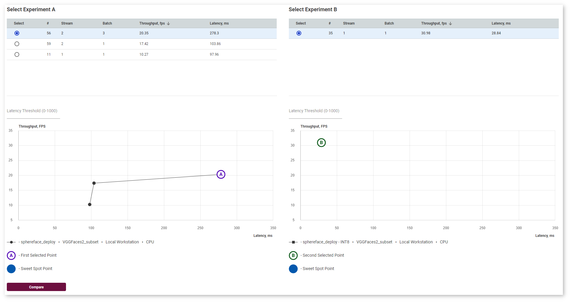
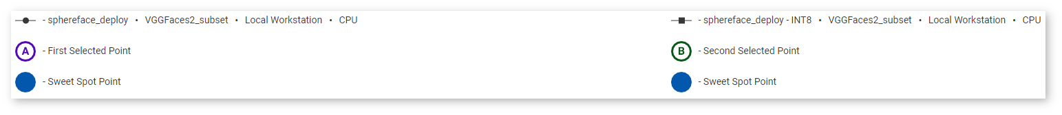
Right under the Inference Results graph, find the graph legend:
In the Latency Threshold box, specify the maximum latency value to find the optimal configuration with the best throughput. The point representing the sweet spot becomes a blue filled circle: 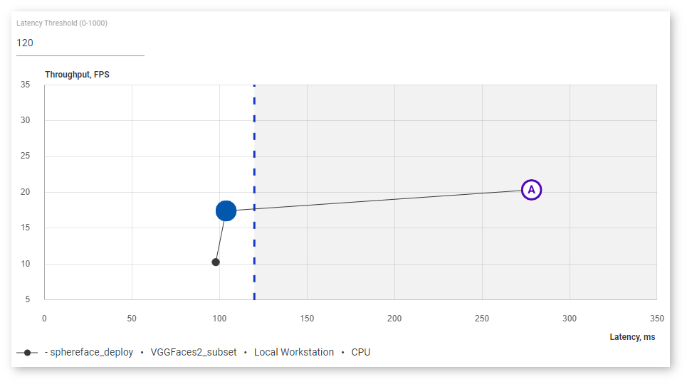
If one of the two compared points happens to be a sweet spot, it turns blue while the letter is still indicated: 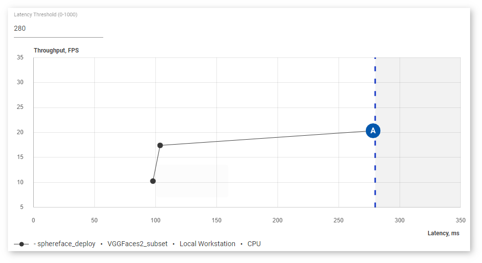
Click Compare to proceed to the detailed analysis. The Model Performance Summary section appears. It contains three tabs:
Performance Summary table contains the table with information on layer types of both projects, their execution time, and the number of layers of each type executed in a certain precision. Layer types are arranged from the most to the least time taken.
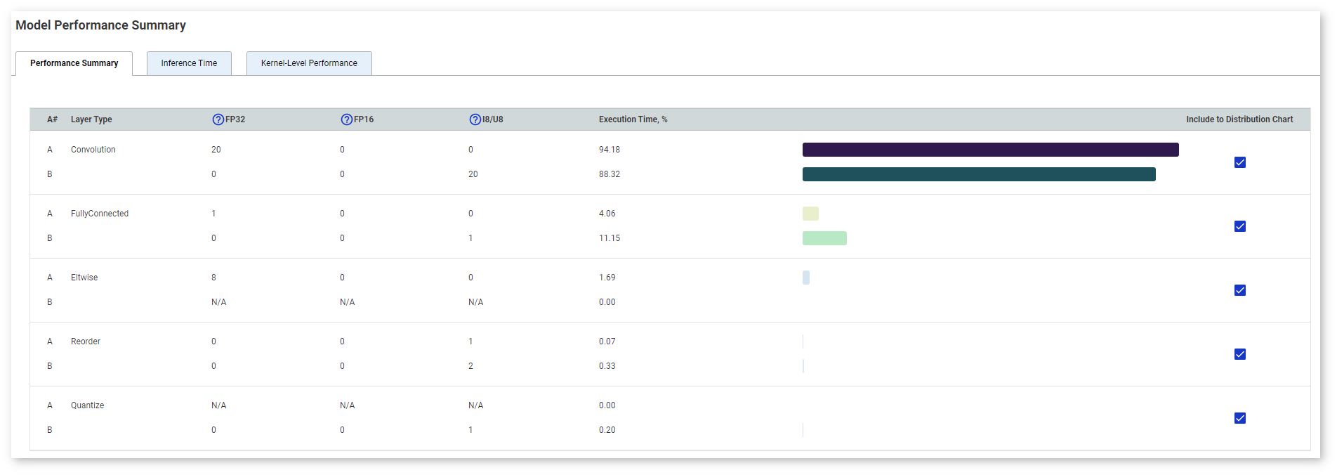
The table visually demonstrates the ratio of time taken by each layer type. Uncheck boxes in the Include to Distribution Chart column to filter out certain layers.
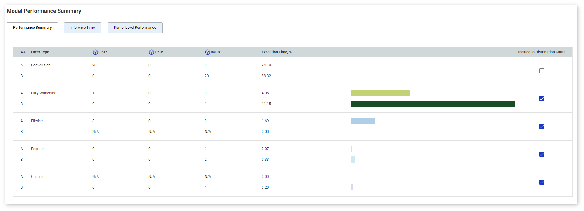
You can sort layers by any parameter by clicking the name of the corresponding column.
Inference Time chart compares throughput and latency values. By default, the chart shows throughput values. Switch to Latency to see the difference in latency values. 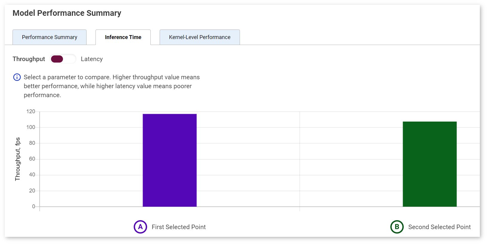
NOTE: The colors used in the Inference Time chart correspond to the colors of the points A and B.
Kernel-Level Performance table shows all layers of both versions of a model. For details on reading the table, see the Per-Layer Comparison section of the Visualize Model page.
