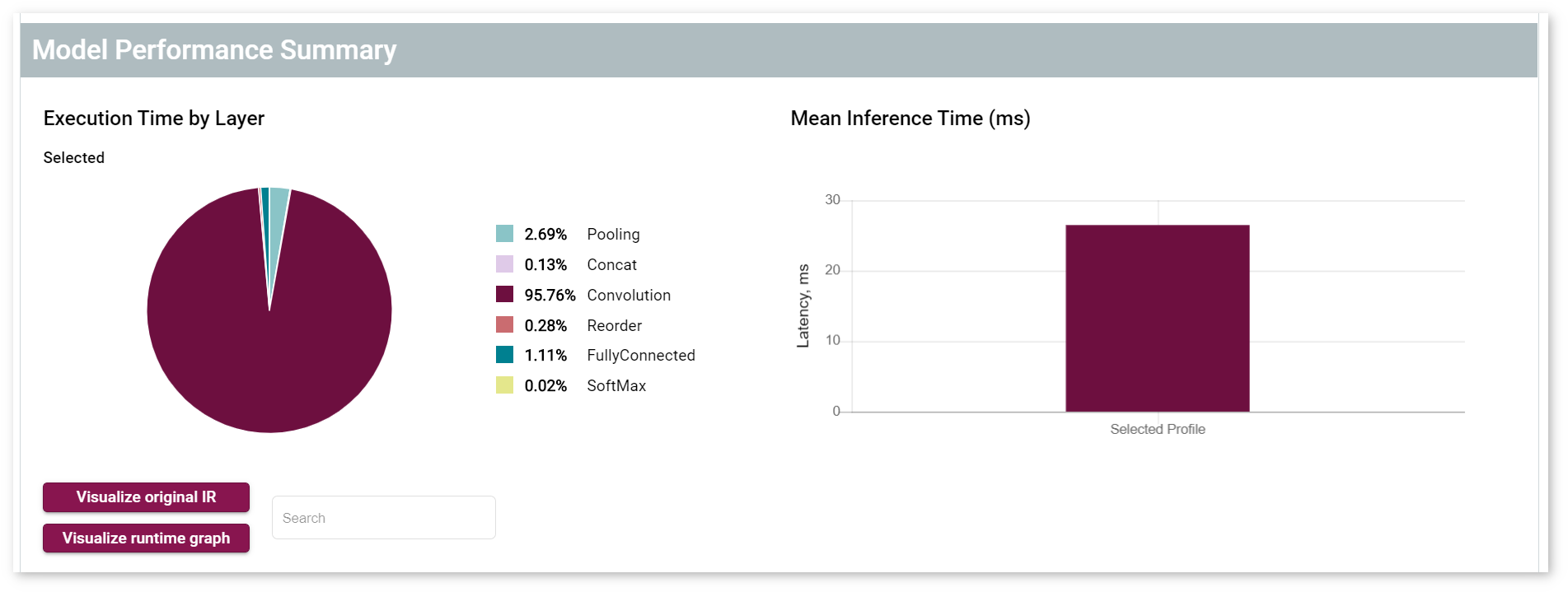
After you have run an intital inference, and your performance data is visible on the dashboard, you can evaluate performance and tune your model. The data appears in the Model Performance Summary on the Projects page. When you have multiple inference results, you can click on specific data points to view model performance details.
Under the Execution Time by Layer pie chart, there are two buttons, Visualize original IR and Visualize runtime graph that allow you to visualize your model in two different ways.
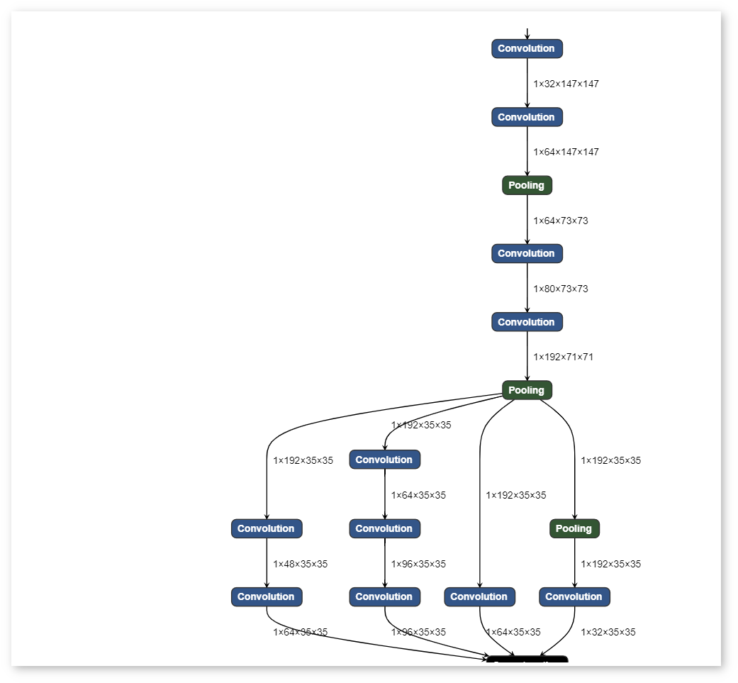
Click on the Visualize original IR button to see a graph representing what an original OpenVINO™ model looks like before it is executed by the Inference Engine:
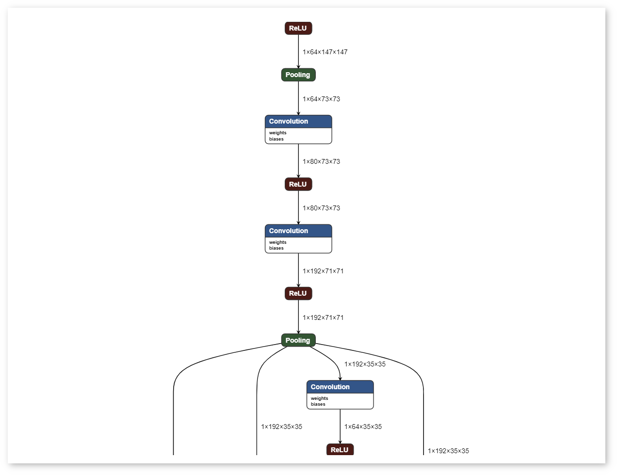
Click on the Visualize runtime graph button to see a graph representing how a model will look when it is executed by the Inference Engine:
In the Runtime graph, some new layers can appear and some old ones can disappear. This happens because a model is changing during the inference process to achieve better performance.
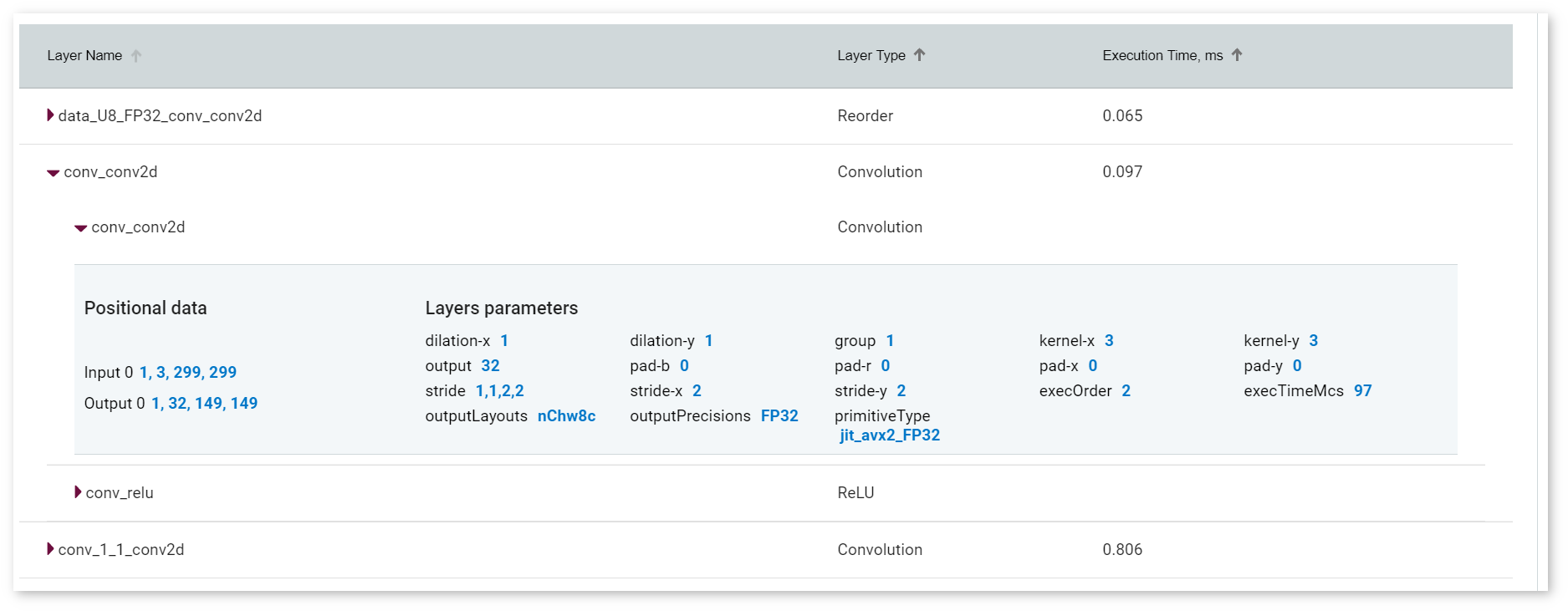
The Layer Name table below shows each layer of a model. For those layers that differ between versions of a model, the top-level rows represent layers of a model during its runtime, while the subrows correspond to the layers of an original IR. Gray areas show combined properties of layers of versions. The layer parameter primitiveType shows a selected primitive type, and the outputPrecisions parameter corresponds to the precision of a model.